
From Frustration to Engagement: Transforming the SolarWinds THWACK Rewards Store
Desktop and Mobile, Launched April 2024

Overview
The THWACK Store is an exclusive rewards program for the SolarWinds IT community, allowing members to redeem points earned through engagement. However, the store’s outdated design and limited functionality were creating frustration for users and inefficiencies for the business.
My Role
As the sole UX designer, I led the end-to-end redesign of the THWACK Store, balancing business goals with user needs under tight constraints. In just three weeks, I assessed platform limitations, identified pain points in the rewards redemption process, and designed an intuitive experience for THWACK members to purchase and redeem their rewards. Partnering closely with developers, I streamlined the migration to Brand Fuel, ensuring UX aligned with technical feasibility. Through data-driven design and rapid iteration, I optimized workflows, improved usability, and enabled a smooth transition, setting the stage for a successful launch.
“We need to migrate our rewards store to a new platform and would like a new design for launch. You have 3 weeks, can you do it?”
Challenge
The THWACK Store’s platform had reached the end of its lifecycle, requiring a migration to Brand Fuel. While this migration solved logistical inefficiencies for stakeholders, it introduced new design challenges:
Users struggled with discoverability and the redemption process.
The outdated interface lacked alignment with SolarWinds’ evolving brand and product ecosystem.
Tight timeline—I had just 3 weeks to go from concept to handoff, ensuring development could complete the migration within 2 months.
Unfamiliar platform—I had never designed within Brand Fuel’s ecosystem before, requiring rapid learning and iteration.
Solution
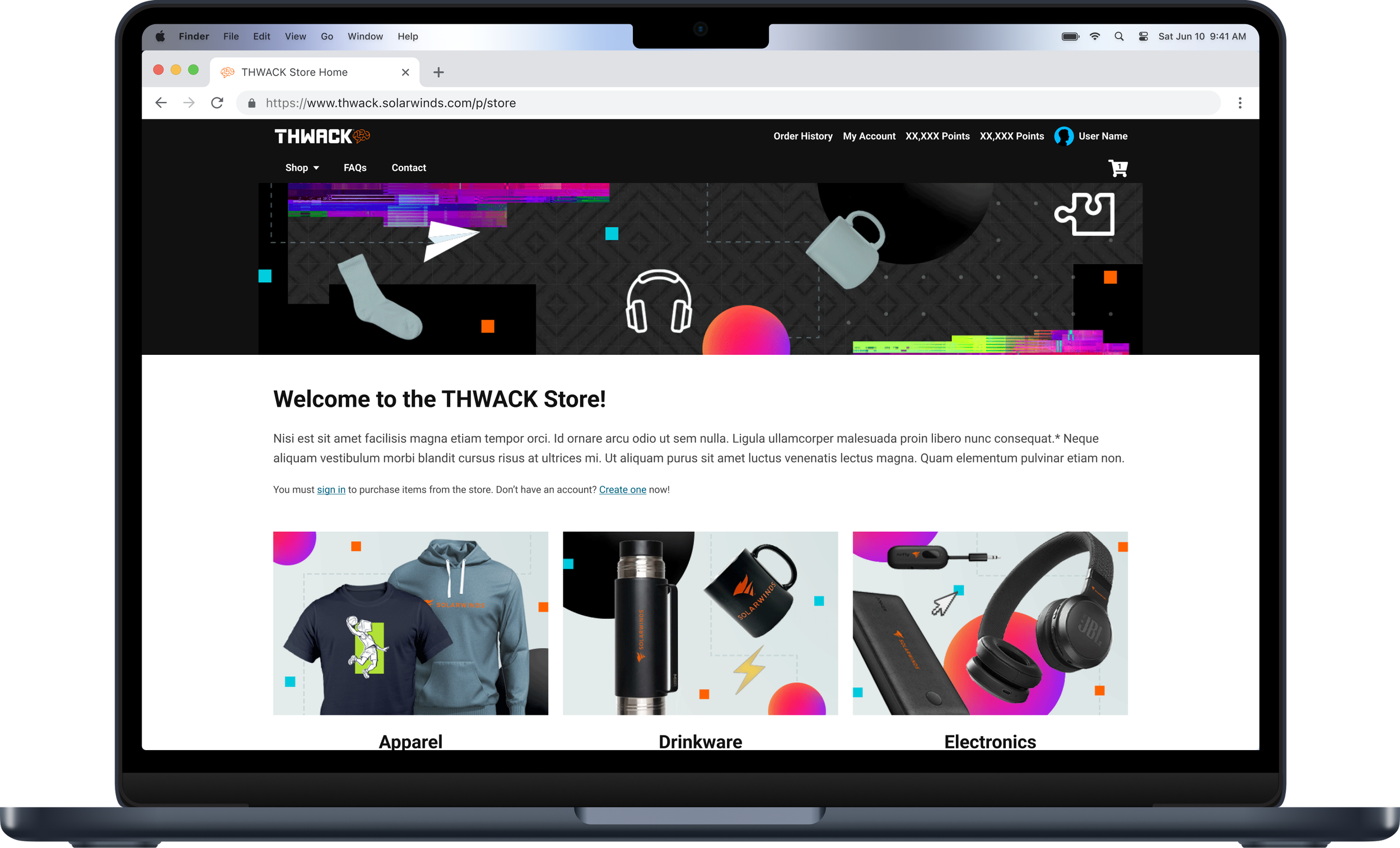
To meet the three-week timeline, I focused on designing within Brand Fuel’s constraints while improving the overall structure of the THWACK Store. Since we were learning the platform’s capabilities as we built, I took an iterative approach—adapting designs quickly based on feasibility. The final design introduced a homepage, index, and product pages, replacing the previous modal-based experience to improve navigation and content organization.
The redesigned store launched successfully within the two-month development timeline, and feedback from the THWACK Community was overwhelmingly positive: "The store looks great!" and "A lot of great stuff in the THWACK Store. Thank you!" Stakeholders also noted that the new design was easier to manage and more in line with SolarWinds’ evolving brand.
Research
THWACK Store Audit
Disjointed journey
The previous store was a single-page experience, relying entirely on modals for navigation. The cart itself was also a modal, accessible only through a navigation button. This setup made it difficult for users to gather product information, compare options, or feel in control of their shopping experience.

Visual overhaul
The primary feedback from stakeholders was that the previous site’s look no longer aligned with SolarWinds’ recent rebrand, specifically the color changes to the new orange. It also lacked proper accessibility, which was critical to address. The challenge was to maintain THWACK’s unique personality while integrating the new brand aesthetics and ensuring the store was accessible to all users.

Community Insights
THWACK's community, known for being highly engaged, provided invaluable insights. Through forum reviews, it was clear users desired more transparency in the store—particularly with regard to product availability, restocks, and new reward releases. This insight became a cornerstone of the redesign, ensuring that users could track their rewards’ status and understand how to earn and redeem points more effectively.
To ensure the THWACK Store met the needs of our users and adhered to SolarWinds' branding, I focused my research on the previous store's performance, user feedback, and competitor analysis. Given the tight 3-week timeline, my research was targeted at identifying quick wins and major pain points to improve both usability and aesthetics.
Competitor Analysis
I examined the loyalty programs of key competitors—New Relic, Red Hat, LogicMonitor, Dynatrace, and Datadog. I discovered that only two direct competitors offered a similar reward system, and both experiences were locked behind logins. To better understand the rewards store landscape, I expanded my research to reward sites across different industries, focusing on those that emphasized gamification, personalization, and social proof.
Nintendo Rewards
Nintendo Rewards offers a visually engaging shopping experience where users can browse and preview rewards before logging in. Cross-selling is well-executed, showing related items and wishlist suggestions. However, point visibility is limited, only appearing at checkout, making it difficult to track affordability while browsing. Navigation and filtering need improvement—search applies to the full site rather than the rewards store, sorting options don’t function, and some filter labels (e.g., “Price” vs. “Points”) are confusing.
Workhuman
Workhuman offers a highly personalized shopping experience, with users’ current points balance prominently displayed before they start shopping. A “Shop by Balance” category makes it easy to find items within their budget, and social proof is leveraged well, showcasing popular items through the “What’s Hot at Your Company” section. The navigation is user-friendly and transparent, with all categories visible and no rewards hidden behind extra links. A basic but effective search includes useful filters like balance, brand, and special offers. While points are earned through peer recognition, nothing is truly locked, as users can purchase the remaining balance if they fall short.
Insights
The previous design had notable accessibility issues, with modal overuse, limited product information, and inefficient navigation, which hindered the overall user experience.
SolarWinds' THWACK rewards program has a strong, loyal user base. THWACKsters are eager for exclusive merchandise and not only spend points but actively engage in activities to earn them.
Key Takeaways from Competitive Research:
Gamification: Many competitors, including Nintendo and Workhuman, integrate gamification effectively to boost user engagement. A comprehensive system involving levels, badges, and missions could be a valuable addition to the new store, driving increased participation and excitement.
Personalization: Competitors like Workhuman excel in providing personalized experiences by prominently displaying users' points balance, recommending items based on their balance, and showcasing popular rewards. These strategies create a more tailored and relevant shopping experience, which we could incorporate into the new design.
Navigation & Filtering: Competitors like Nintendo highlight the importance of clear and effective navigation and filtering. Current pain points in SolarWinds' store, like limited visibility of points and poor filtering, could be addressed with a more intuitive system. Improvements to the navigation and filtering could make it easier for users to find rewards within their budget and discover items based on their preferences.
By focusing on these areas—gamification, personalization, and navigation—I began ideating solutions that would create a more engaging, intuitive, and user-centered reward store.
Exploration
To assess the starting point for our designs, we reviewed the initial template work that had been completed by the platform team. During that meeting, stakeholders requested an additional page—a dedicated homepage to showcase the categories for the initial rewards at launch. I conducted a card sorting exercise to determine the most intuitive reward categories, ultimately landing on Apparel, Electronics, Office, Drinkware, and Gifts.
Given the limited timeframe, we agreed to prioritize the homepage, category index, and product page, as they were the most critical touchpoints in the user journey. Focusing on these ensured that the most visible and impactful parts of the experience were refined first.

Initial Templates
Home, Index, & Product Pages
Option 1: Streamlined & Aligned with Existing Platform – A straightforward approach that closely follows the platform’s existing structure, with improvements like a filter system for categories and additional product details (color, size) for clarity.
Option 2: Personalized & Holistic Experience – A more user-centric redesign that transforms the homepage into a dynamic hub featuring personalized details (welcome message, THWACK points, shopping by points), marketing space, and events. The category and product pages optimize space, refine product views, and enhance usability.
While stakeholders were drawn to the personalized and holistic experience of Option 2, they ultimately selected Option 1 due to its close alignment with the platform’s existing structure and feasibility within the project timeline. Additionally, implementing the filtering system required backend development that was still being figured out, making a more streamlined approach the most practical choice for launch.
Tech Specialist walking the team through the current status of the filtering system,
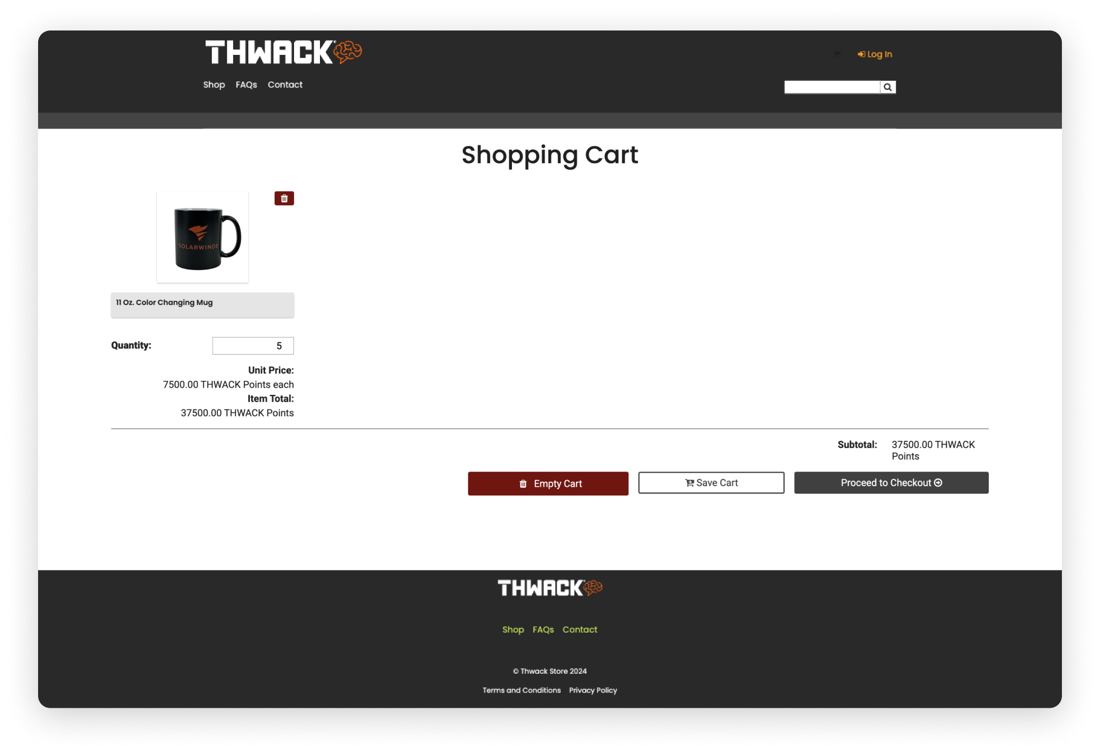
Navigation and Shopping Cart Pages
As we refined these pages based on stakeholder feedback and platform capabilities, I also evaluated the navigation, incorporating patterns from THWACK.solarwinds.com to maintain consistency. During this process, I realized the shopping cart page wasn’t included in our initial priorities, yet it played a key role in the redemption journey. The existing template had a confusing user flow, so I recommended adding it to our scope. This meant adapting our designs in real time, balancing stakeholder requests with platform constraints to create a seamless and intuitive checkout experience.
Previous shopping cart layout
Keeping the conventions of the selected simplified version in mind—and considering this addition came later in the project—I designed this wireframe to maintain consistency with the approved pages while minimizing additional development effort. Stakeholders wanted the navigation to closely match THWACK.solarwinds.com, so I integrated the necessary elements from the shop navigation into that existing structure.

Minimal changes were needed for these additions, as they aligned well with stakeholder expectations and platform constraints. The refined navigation maintained consistency with existing SolarWinds properties, and the shopping cart updates improved the checkout experience without adding significant development overhead.
With approvals in place, I set up a meeting with the creative team to align on photography needs, finalizing a shot list and asset list. A few adjustments were made due to backend logic constraints, requiring slight refinements to the wireframes. After incorporating all feedback, I presented the updated mocks, which were approved. Once we received final assets, I created the high-fidelity wireframes and scheduled a handoff meeting with the Technical Specialist to ensure a smooth transition into development.
Final Design
The Verdict

The new store was well-received in the THWACK forums.
Next Steps
Future Iterations
Towards the end of development we discovered that Technical Specialist assigned to our account would have limited bandwidth going forward and would be unable to make any significant changes after launch. If we have the opportunity to make further adjustments, here’s what I would tackle next:
Increase Gamification
This is still possible even without touching the store. With such an involved community, the THWACK Store and THWACK site in general present a great opportunity for gamification. THWACK Points or coins are just the beginning and if given the chance I think there’s the opportunity for a really robust system.
Listen to the TWHACKsters
We are very fortunate that the THWACK community is so active. I would love to get direct feedback from the community through more intentional means, surveys and interviews about how the rewards store works for them. There’s no better way to find out what parts of the journey could be improved than by walking through it with them.
Lessons Learned
-
Especially with projects with tight deadlines, I’ve found it beneficial to include design, development, and content early in the process because it helps identify potential challenges upfront allow more time for exploration and iteration.
Although there were no delays, earlier alignment between the Community teams goal, Brand Fuel’s capabilities and everyone’s overall expectations would have helped avoid additional revisions.
-
This project was a lesson in balancing “innovation” with familiarity. There were many features I would have liked to have seen come to fruition to make a more impact change to the rewards store however the users were satisfied with the simplicity of the final journey.
On the other hand, with such a tight deadline, you can move too fast and miss opportunities to step back and evaluate what incremental changes could improve what’s already there.
-
My previous experience in these languages was invaluable in collaborating with the Technical Specialist. I was able to understand why certain design decisions weren’t possible as well find solutions and help translate design decisions into technical requirements within our timeframe.