THWACK Store Redesign
Overview
The THWACK team’s roadmap for 2024 included a migration of their store to from their site to a Brand Fuel managed site. I was brought in midway through process for ux recommendations on styling, journey, and functionality and to provide basic wireframes for Brand Fuel’s engineers to build from.
Role UX Designer
Team Creative Team, Business Analyst, Delivery Manager, Brandfuel
Deliverables Med-Fi Wireframes
Timeframe 1 Month
audit
I first went through the current THWACK store to explore what quick wins could migrate the site as quick as possible and what were opportunities for the future. I reviewed the logged in, logged out, and a mobile states of the current site, what the Brand Fuel team had already started working on, and some examples that the stakeholders had mentioned to keep in mind.

The Problem
After reviewing all the available and also doing some independent research on online storefronts (Target, Walmart, and Employee, Airlines and credit cards redemption sites), I created the following 3 categories:
Quick Wins
Can be Addressed almost immediately
Update the style so colors are inline with current brand guidelines and are accessible
New product photography
Addition of a category page
New hero images
Provide desktop and mobile views
Nice to Haves
if we have some extra time
Filter system, to sort by categories easier
System to determine eligibility for prizes based on members current point total before adding to basket
Make site fully responsive

Future State
Dive into later when time allows
Look into gamifying THWACK building a bigger loyalty program off the current community: “Coins”, How to win points, plus advocacy integration (badges, tiers) there’s a great opportunity to connection everyones goals in encouraging more participation on the site and beyond.
Concept
Sketching
Created some quick marker to paper sketches to get some general ideas down. Some iterations brought functionality questions to light which I brought to the attention of the PM on the project for him to reach out to the stakeholders and Brand Fuel in order to get an understand on capabilities and limitations before we got further into the project.

Building Structure
The main THWACK site is built to have a max container of 1440px. It it the only site of SolarWinds to have that width. With the redesign of the main THWACK site still come and the need to keep the styling consistent, we ended up keeping the store at 1440px as well, but I created a grid layout for the development to reference at it widest point and the small size we build for 375px.

Iteration 1
For the first round, the focus was on the home, category, and product page templates as the FAQ and Contact pages just needed slight brand adjustments.
While the stakeholders we happy, I feel like a few areas needed some more work. Mainly how the THWACK points were going to be displayed,

Iteration 2
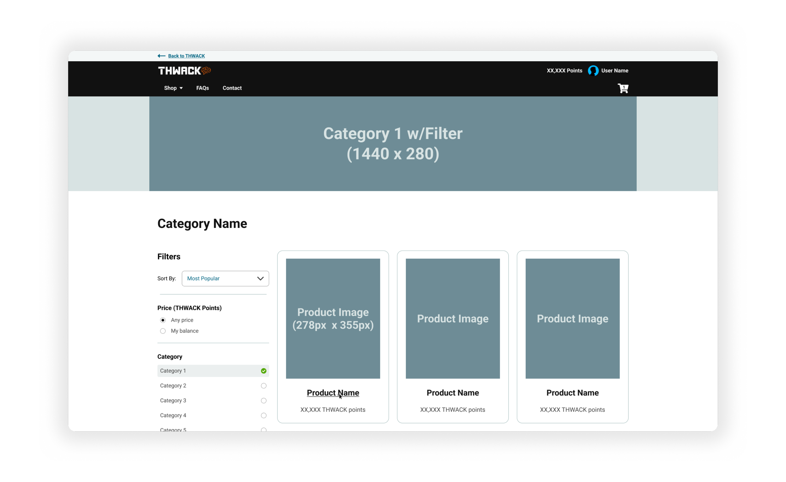
Round 2 involved ways to start introducing that purpose and importance of THWACK points and how to earn them, and biggest point section call out for the member, and a more detail product page with selectors to keep in mind that Apparel will be sold in the store so the member can choose their correct size. We also removed the add to cart buttons from category pages as well due that same reason.
This was also the time to recommend the removal of the home category page as the list of products would only be 4. I suggest one page similar to the original store landing page but with a filter added, so users to sort to their liking.
The stakeholders still wanted to have a homepage with the categories only, but now each individual category would get a filter. The additions to the product page were approved.

Card Sorting
We needed to solidify what categories these 21 products were going to be sorted into. I had one stakeholder, one member of the sales team, and my ux teammates perform an open card sort to compare what category names the each came up with (in yellow) and compare their results with my beginning sort of the original product list I was given and decided that we would test this grouping of categories first:
Apparel / Electronics / Office / Drinkware / Gifts

design
Final Iteration…?
I set a meeting with the creative team to walk them through what our photographic need would be and finalize a shot and asset list. I presented my updated mocks based off all the feedback received and everything was approved.


Store Site Progress, showcasing how they are getting the Filter system to work
next steps
Mobile Menu
Since we do not have access to the current staging of the store, sometimes we are unable to catch things we may have missed until our next meetings. During the most recent discussion I asked about mobile and noticed that there are additional items we did not consider when making the original mocks.
So up next will be to take what’s in staging, mix with the concept I created and see what the end result will be.

What have I learned?
Getting in early on a project is crucial when they are tight turnarounds so that we can understand the full scope as close to the beginning as possible and we don’t overlook important aspects of the project.
Visuals come in handy especially when conveying a message to stakeholders.