
Redesigning the rewards ecosystem
THWACK Store, e-commerce, 2024
Sole UX designer to responsible for the web experience for redeeming rewards through THWACK.
Redesign, Research, Information Architecture, Prototyping
Duration & Status
3 weeks
Launched April 2024 (live)
Team
1 program manager
1 technical specialist
2 graphic designers (photography & imagery assets)

Overview
The THWACK store’s platform had reached the end of its support lifecycle, creating logistical challenges and manual inefficiencies for the THWACK Community team as they managed reward redemptions for THWACKsters (community members). To address these issues, the team chose to migrate to a new platform, Brand Fuel.
As the solo UX designer brought in on the project, I was given 3 weeks to go from concept to handoff, so the development team could spend the next 2 months in production for launch.
THE PROBLEM
“We need to migrate our rewards store to a new platform and would like a new design for launch. You have 3 weeks, can you do it?”
The Community team wanted to use this migration as an opportunity to refresh the store site. There were a few constraints that made navigating this project challenging:
3 weeks until final redlines.
Most of the migration time needed to be spent developing so the designs were needed fast. We had 2 weeks to lock in a final design with the 3rd week finalizing pages and assets for development.
Building in an unknown platform.
There was no extra time to spend exploring the new platform, so I had to keep in close contact with Brand Fuel to as I designed learned the capabilities and limitations.
Limited store access.
The previous THWACK store site was sunsetted before I was brought on to the project. This meant I could only refer to old screenshots found on the THWACK community site conduct a visual audit. As for functionality I made sure to ask as many questions to the PM and stakeholders
RESEARCH
THWACK Store Analysis
Disjointed journey
Most actions were conducted through modals. Rewards were immediately added to cart. There were no product pages where users could read descriptions or choose their own quantity without having to add to cart multiple times.

Visual overhaul
The biggest pain for stakeholders was the look of the previous site. SolarWinds had just come through a rebrand which included significant color changes however, accessibility had not been accounted for when the new orange was pushed to the site. We needed to find a way to incorporate the new brand, stay true to the uniqueness of THWACK, and keep it accessible.

Listen to the people
THWACK is extremely lucky to have such vocal community. THWACKsters provide useful feedback just as quickly as they provide praise. I looked through recent forums to glean any insights on pains they were experiencing. Even from a quick review, it was evident that users wanted more visibility into the status of rewards such as restocks and new items releases and well as how to earn and use their points.
After the initial meeting, I spent the next 2 days auditing the previous store and various competitors. Due to the limited timeframe, I kept my research focused towards quick wins but also kept an eye out for unique opportunities to improve the overall experience in earning and redeeming THWACK points.
Competitor Analysis
I looked at loyalty programs of our closest competitors (New Relic, Red Hat, LogicMonitor, Dynatrace, and Datadog). I was surprised to learn that only 2 of our 5 closest competitors had something vaguely similar to what we were offering, and both of those experiences were hidden behind logins.
I next looked at retail and reward sites spanning various industries, before narrowing down to ones that had reward experiences focusing on the exclusivity of the items available. I also looked a how each site approached gamification as well as smaller functional details that could improve our current redemption process.
SYNTHESIS
Insights
Overall the previous design design failed to account for accessibility, and the user experience was hindered by modal overuse, limited product information, and inefficient navigation.
SolarWind’s THWACK rewards program is one of the longer standing loyalty programs in the industry. THWACKsters are hungry for new exclusive merch and not only are willing to spend their points, but participate in the activities to earn them.
Keep it Consistent: Even though the new store was to be housed on a new platform, we needed to make sure that the design still aligned with THWACK community branding as much as possible, creating a cohesive experience.
Keep it Simple: The main objective of the is project was to migrate the store with a new look and feel. Nothing significant needed to change but there were opportunities to create a more intuitive journey and reduce unnecessary friction.
PUT A PIN IN IT
Gamification
Gamification is a big aspect to many rewards stores online. Companies make is easy for users to understand how to play and win. The new store could be a great opportunity to build out a full system, complete with levels, badges, branded coins, mission boards and more.
While I did bit of concepting during the beginning of design exploration, I knew I needed to focus on the larger visual redesign first. I set this idea aside with the hopes to revisit with the stakeholders later especially with an Advocacy program in the works.
After prioritizing what needed to be accomplished, I created a few principles to keep in mind as I started designing:
Keep it Clear: We needed to take a deep look at the current content within the store as well as the community forums that promote it. Everything should be clearly communicated to inform users during their redeeming journey.
IDEATION
Card sorting for categories
The stakeholder provided a list of rewards that were to be available on launch but they had not be sorted. Before I could make any recommendations, we needed to solidify what categories these 21 products were going to be sorted into.
I had invited my stakeholder, a member of the sales team, and my UX teammates to an open card sort and compared their answers in addition to mine, which resulted in the follow groups:
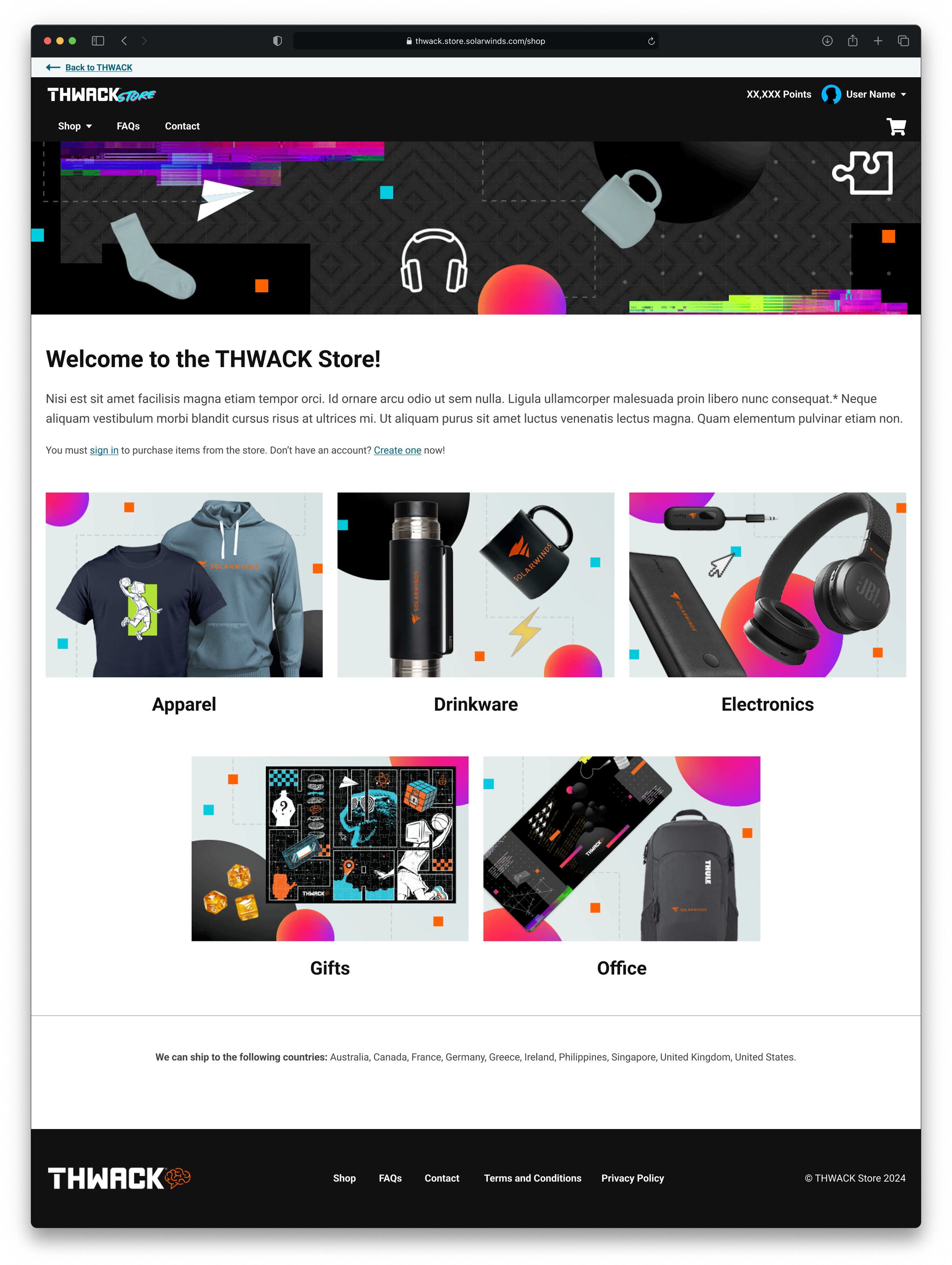
Apparel / Electronics / Office / Drinkware / Gifts

Testing Platform Limits: Straight into Hifi
Given the limited runway, we decided to narrow the scope and focus on the pages which would make the largest impact in the redemption journey: Home, Category Index, Product, and Shopping Cart.
By the following week, I had created mocks for those pages to receive as much feedback as possible in our next meeting. The mockups were intentionally crafted to facilitate conversations with the platform team regarding the constraints of their feature set.
The proposed storefront kept it simple and followed regular retail conventions. The homepage changed the most as it now was hub for users to get all their information at a glance before shopping. It was also a place for the Community team to market events and missions that provided users to earn more points for the store.


Platform limitations & Pivoting
In the second week after discussing the mocks we gained access to what platform team had already started building. Based off feedback and a look at the out of box feature set, we moved into rapid iterations finding a middle ground between both sets of designs that could still be accomplished within our deadline.

Rapid Ideation
Version 1
With a deeper understanding of the platform capabilities, I went back to work stripping down the designs into the basic functionality. I reduced my focus to the home, category, and product page.

Version 2
My second option is the one I recommended, and it struck a compromise between the first round's innovation, and the platform's off-the-shelf capabilities
I condensed the THWACK point sections onto the category page, so user still had quick access to that information, removed add to cart buttons since users had to visit the product page first anyway, and added back in sizing and potential color if THWACK was to sell similar shirts.
I strongly recommended adding back in the sort and filter for when the store grew and it just making it easier for users who had a specific category of items they wanted to see.


Store Site Progress, showcasing the logic on filters.
DESIGN
Final Designs
I set a meeting with the creative team to walk them through our photography needs and to finalize a shot list and asset list.
A few adjustments had to be made due to complications with logic on the back end so I adjusted the frames. I presented my updated mocks based off all the feedback received and everything was approved.
Once we received final assets I created the final hifi wireframes and set up a handoff meeting with the Technical Specialist.


THE VERDICT

The new store was well-received in the THWACK forums.
NEXT STEPS
Future Iterations
Towards the end of development we discovered that Technical Specialist assigned to our account would have limited bandwidth going forward and would be unable to make any significant changes after launch. If we have the opportunity to make further adjustments, here’s what I would tackle next:
Increase Gamification
This is still possible even without touching the store. With such an involved community, the THWACK Store and THWACK site in general present a great opportunity for gamification. THWACK Points or coins are just the beginning and if given the chance I think there’s the opportunity for a really robust system.
Listen to the TWHACKsters
We are very fortunate that the THWACK community is so active. I would love to get direct feedback from the community through more intentional means, surveys and interviews about how the rewards store works for them. There’s no better way to find out what parts of the journey could be improved than by walking through it with them.
RETROSPECTIVE
Lessons Learned
-
Especially with projects with tight deadlines, I’ve found it beneficial to include design, development, and content early in the process because it helps identify potential challenges upfront allow more time for exploration and iteration.
Although there were no delays, earlier alignment between the Community teams goal, Brand Fuel’s capabilities and everyone’s overall expectations would have helped avoid additional revisions.
-
This project was a lesson in balancing “innovation” with familiarity. There were many features I would have liked to have seen come to fruition to make a more impact change to the rewards store however the users were satisfied with the simplicity of the final journey.
On the other hand, with such a tight deadline, you can move too fast and miss opportunities to step back and evaluate what incremental changes could improve what’s already there.
-
My previous experience in these languages was invaluable in collaborating with the Technical Specialist. I was able to understand why certain design decisions weren’t possible as well find solutions and help translate design decisions into technical requirements within our timeframe.