Redesigned the rewards ecosystem
THWACK Store, e-commerce, 2024
Sole UX designer to responsible for the web experience for redeeming rewards through THWACK.
Redesign, Research, Information Architecture, Prototyping
Duration & Status
1 month,
Launched April 2024 (live)
Team
1 program manager, 1 technical specialist, 2 graphic designers

Overview
The THWACK store’s platform had reached the end of its support lifecycle, creating logistical challenges and manual inefficiencies for the THWACK Community team as they managed reward redemptions for THWACKsters (community members). To address these issues, the team chose to migrate to a new platform, Brand Fuel, with a vision for a custom-designed template tailored to their needs rather than using an out-of-the-box solution.
With just three weeks remaining before development was set to begin, I was brought on to lead the design effort. Collaborating closely with the Brand Fuel team, my Product Manager, and the Community team, I worked diligently to ensure a seamless handoff and met the tight project deadline.
THE PROBLEM
We need a new rewards store designed in 2 weeks. Can you do it?
While I have been under tight deadlines before, this project was the first one to this extent. The new platform the store was migrating to had templates but the stakeholders wanted something different. Their goal was to focus on the front-facing pages (home, index, product, fax, and contact).
2 weeks to redesign a store. Most of the migration time needed to be spent developing so the designs were needed fast.
Building in an unknown platform. We didn’t know what we couldn’t do until we couldn’t do it. The designs had to be build for best case and then scaled back as we received feedback of the platform’s capabilities and limitations as we went along.
Limited store access. The previous THWACK store site was sunsetted before I was brought on to the project so I was unable to experience that journey (other than old screenshots) before exploring opportunites to improve it
RESEARCH
Store Analysis
Disjointed journey
Most actions were conducted through modals. Rewards were immediately added to cart. There were no product pages where users could read descriptions or choose their own quantity without having to add to cart multiple times.

Visual overhaul
The biggest pain for stakeholders was the look of the previous site. SolarWinds had just come through a rebrand which included significant color changes however, accessibility had not been accounted for when the new orange was pushed to the site. We needed to find a way to incorporate the new brand, stay true to the uniqueness of THWACK, and keep it accessible.

Listen to the people
THWACK is extremely lucky to have such vocal community. THWACKsters provide useful feedback just as much as they will give praise. While we didn’t have time to interview users, I did look through recent forums to glean any insights on pains they were experiencing. Fortunately there was nothing too significant here that couldn’t be fixed with a bit more visibility into user and product status.
After the initial meeting I spent the next 2 days auditing the previous store, what Brand Fuel had already set up as a base template, and analogous competitors. My focus was directly towards quick wins but I also kept an eye out for unique opportunities to improve the overall experience or earning and redeeming THWACK points.
Competitor Analysis
My exploration began with looking at SolarWinds closest competitors (New Relic, Red Hat, Logic Monitor, Dynatrace, and Datadog to see what type of loyalty or rewards program they had.
I next looked at popular retail sites, before narrowing down to ones that had reward experiences focusing on the exclusivity of the items available. I also took a look at gamification and the smaller functional details within the redemption process itself.
SYNTHESIS
Insights
I distilled my findings
The existing THWACK Rewards Store suffered from redundancy in content and inefficient user flows. The design lacked accessibility considerations, and the user experience was hindered by modal overuse, limited product information, and poor navigation.
Prioritize pages
With the current time table, pages like order history and save carts were not going to be
Unique Value Prop
SolarWind’s THWACK rewards is one of the longer standing rewards programs in the industry. Only one direct competitor seemed to have a similar program but it was only launched in mid 2023. THWACKsters are hungry for new exclusive merch and not only are willing to spend their points, but participate in the activities to earn them.
We need to play up Gamification
Gamification is a big aspect to many rewards stores online. Company’s make is easy for users to understand how to play and win. THWACK could use the new store as way to be a bit more
Content
We needed to take a deep look at the current content within the store as well as the community forums that promoted it.
IDEATION
Hi
After getting a better understanding for the rewards store landscape, I created


TURNING POINT
Pull back. Way back. And let’s look at templates.
A look inside
I spent two days auditing THWACK store page as well as analogous competitors through out various industries.

THWACK summary that sees over 200,000 unique visitors in a year
The existing THWACK Rewards Store suffered from redundancy in content and inefficient user flows. The design lacked accessibility considerations, and the user experience was hindered by modal overuse, limited product information, and poor navigation.
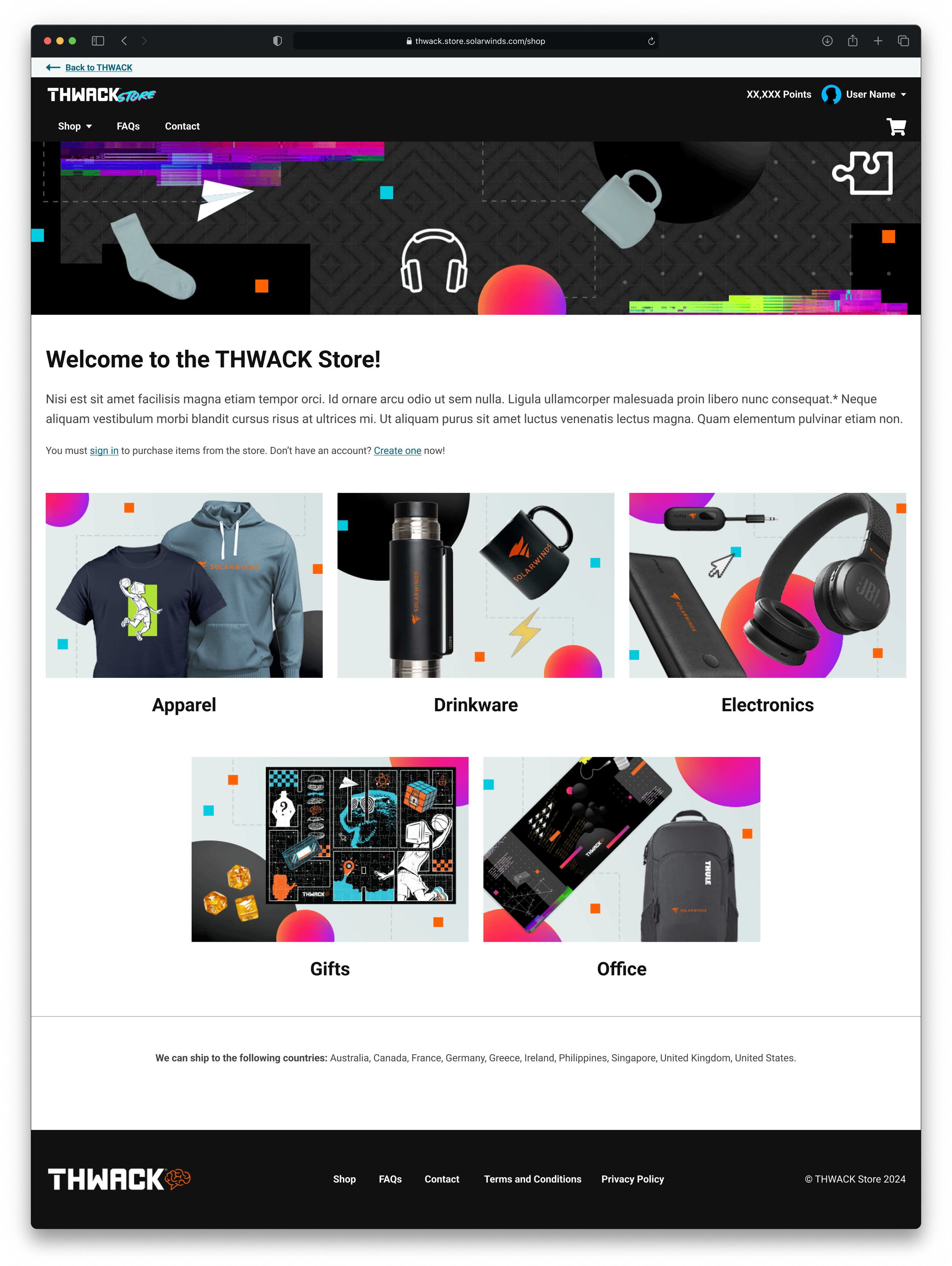


DESIGN
Final Designs
THWACK summary that sees over 200,000 unique visitors in a year
There were too many popups, used incorrectly. Every action required a new modal. THye are find for quick action but if user is trying to review their cart scrolling becomes necessary in order to review everything. We’d rather the user be confident in selecting and seeing all there quantities at the same time.
THWACK summary that sees over 200,000 unique visitors in a year
Accessibility was an issue, the new branded Orange was limited in the spaces it could be used. As I had already lead the Accessibility Audit for the SolarWinds.com site the previous year, I had discussion with the graphic design team on why certain colors could not be used in certain spaces. Certain type was too small
THWACK summary that sees over 200,000 unique visitors in a year
The existing THWACK Rewards Store suffered from redundancy in content and inefficient user flows. The design lacked accessibility considerations, and the user
THWACK summary that sees over 200,000 unique visitors in a year
The existing THWACK Rewards Store suffered from redundancy in content and inefficient user flows. The design lacked accessibility considerations, and the user experience was hindered by modal overuse, limited product information, and poor navigation.
FINAL DESIGNS
Before/After
The existing THWACK Rewards Store suffered from redundancy in content and inefficient user flows. The design lacked accessibility considerations, and the user experience was hindered by modal overuse, limited product information, and poor navigation.
RETROSPECTIVE
Lessons Learned
-
Coming in on the tail end of the project, I believe that
I was brought on near the tail end of the project but I believe with
Involving design, development, content early on in project with such a tight turn-around is crucial in understanding and accounting for what’s possible.
-
Even with all the time in the world, and a solo designer.
-
Working with a developer from another company, remotely. I now create a meeting for handoff for the BAs as well as any documentation.
NEXT STEPS
Increase Gamification
The THWACK Store and THWACK site in general presents a great opportunity for gamification. Due to the time and development constraints we were unable to dedicate a deep dive
Listen to the TWHACKsters
We are very fortunate that the THWACK community is so active.
Interview and survey the community.
I think we need to make a plan for a survey and offer THWACK points for participating inquiring about the new store. There’s no better way to find out what parts of the journey could be improved than by the community who actually enjoys using the site.
I have seen comments in the forum like this. Quick fixes that were addressed in the designs but were never implemented.
This was an interesting comment. Not much detail, but I am curious as to why the user is unhappy. Did we make too many concessions in pushing this out too early? What it the theme? The variety of products?
Gamification
The THWACK Store and THWACK site in general presents a great opportunity for gamification. Due to the time and development constraints we were unable to dedicate a deep dive