Overview
The Goodwill Career & Technical Academy (GCTA) provides adults the opportunity to earn industry-recognized job certifications with a set of programs that is constantly growing. Their previous landing page was becoming overcrowded and constrained so we were tasked with designing a more expansive separate website.
Role
Visual & UX Designer
Client
The Goodwill Career & Technical Academy
Deliverables
Live Website
Overview
Challenge
The clients wanted to bring community awareness to the GCTA program, reduce confusion on all sides and increase student enrollment with current updated information.
Solution
We focused on creating an informative online experience for potential students, partners, and donors with templated pages so the clients could update whenever needed.
EMPATHIZE
How do we create a site that can easily change with the ever-growing programs of the GCTA?

Problem
The previous landing page was just that, a page. One single sad page. There were multiples of the same links in close proximity to each other. Each program link led to a pdf flyer and that was all the information a prospective student had. And since the programs changed schedules, names, and openings so quickly, it difficult was to keep those updated to be useful.
Students were confused and admin was frustrated that they had to wait for our design team to make edits and re-upload the flyers every time information on their side changed.
DEFINE
Project Goals
OBJECTIVE 1
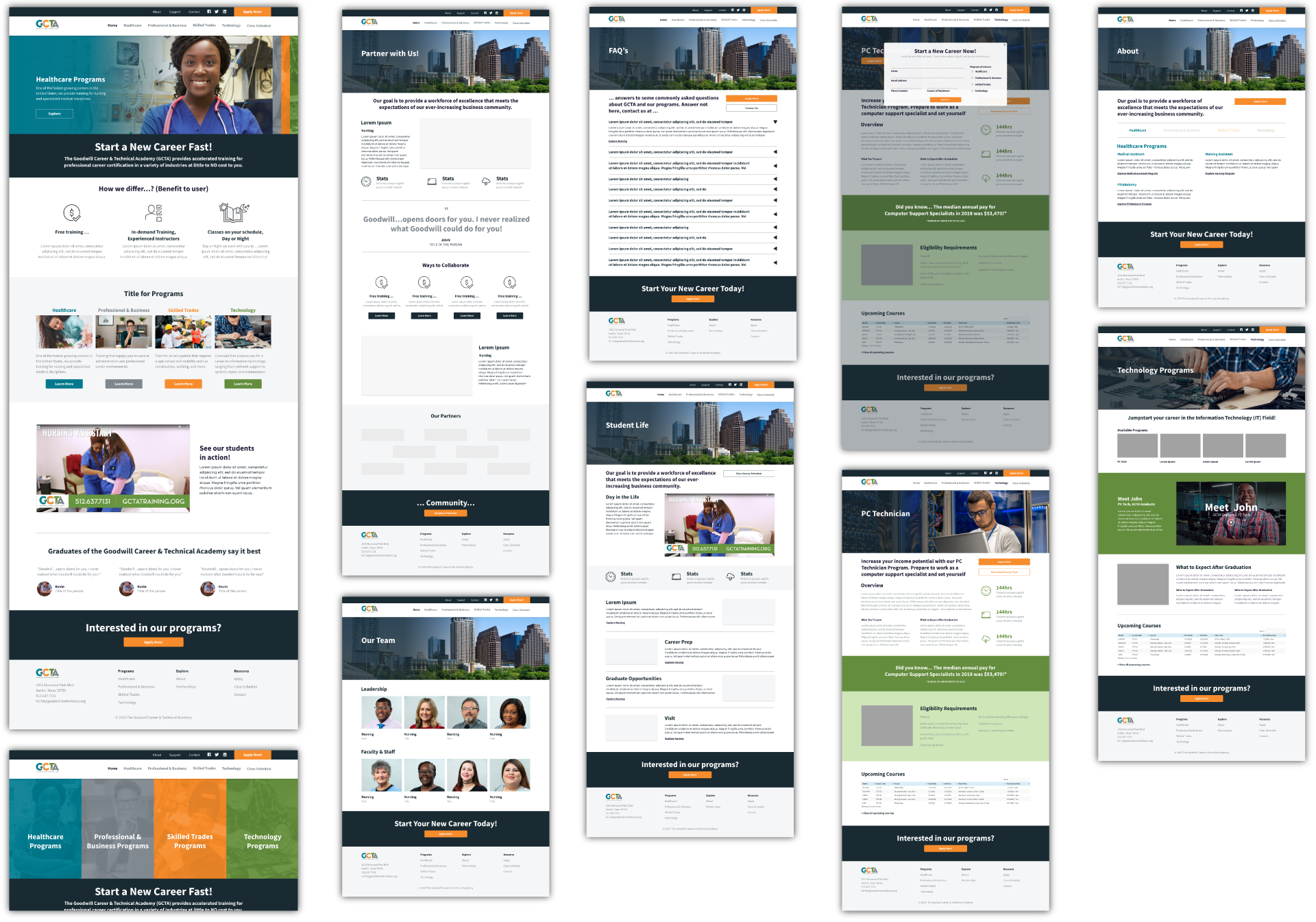
Showcase the verticals. The previous landing page not only had a lot of content confined to a small space, but most of it was repetitive. With this new site we separated each of the verticals (Healthcare, Technology, Skilled Trades, Business) so that potential students could learn about each one as a whole and then dive into the specific programs each vertical had.
OBJECTIVE 2
Being flexible was super important in this design. News programs are being added all the time and information was constantly changing. The website needed to be flexible enough to quickly adapt to the changes. We had previously tried to template the program flyers so that the client could adjust those on the fly however we didn’t want to sacrifice the brand.
We would ultimately need to have a base template.
A useful design for users on the site to learn about the program but a simple design so our developer could teach our clients how to quickly update any information after the website was developed handed over.
Ideate
Mid-Fidelity Wireframes
HOMEPAGE ITERATIONS and progression as the landing page turned from an internal page to its own website during talks with the client.

PROGRAM PAGE ITERATIONS Early iterations of program pages where we determine what information was needed for prospective students such as estimated salaries, course dates, what they could expect learn and possible career opportunities.