1 website. 85 tickets. 6 weeks.
The SolarWinds website underwent multiple style changes within a short timeframe, leading to numerous inconsistencies and across various content management systems and accessibility issues on the site. An accessibility audit was conducted over 8 pages on the site and the ux team was tasked with solving for all assigned issues that arose. I led execution of this audit as Project Manager for the ux team and was responsible for assessing, assigning tasks, and ensuring that everyone stayed on track to meet the tight deadline of bringing the entire website into compliance by the end of 2023. I also served as a ux designer, providing recommendations to the development team for updates.
Role: UX Designer, Project Lead, Project Manager
Team: UX, Creative, Business Analyst, Delivery Managers
Deliverables: Accessibility Recommendations, Redlines
Timeframe: 6 Weeks
Scope
The Challenge
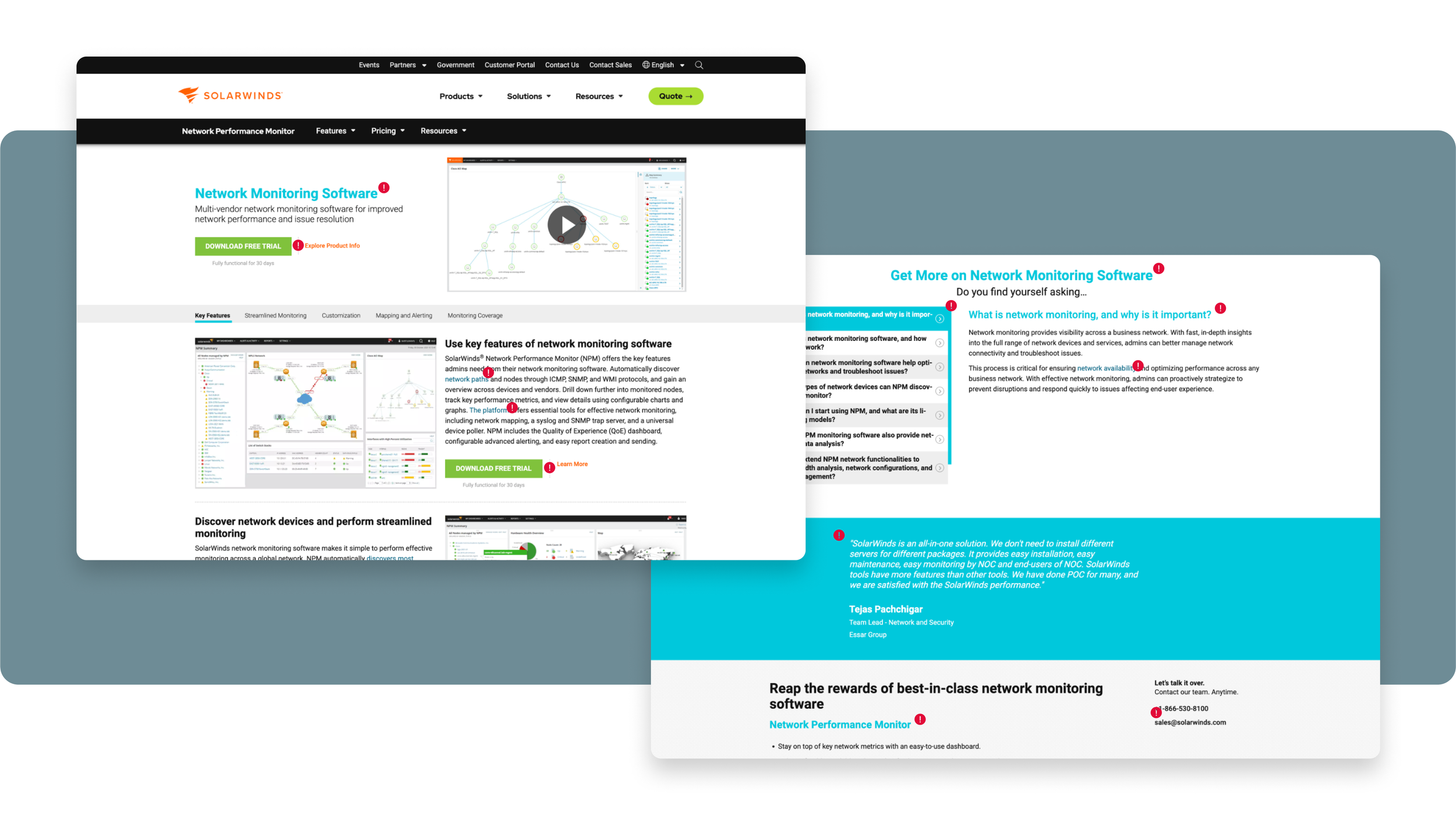
The 8 Pages below were audited as a sampling of solarwinds.com.
Before our team could begin, I had to comb through over 400 tickets that came back in the audit and determine which were issues that our ux team could provide accessibility recommendations for.
Homepage
Product
Registration
Use Case & Index
Contact Us
Solutions
Resources
Case Study

As I began to group our like tickets within JIRA, I noticed the issues broke down into 3 main areas:

Contrast Ratios
The Contrast Ratios for Headers, Button, Link Colors, and some Full Components were insufficient. They all needed to be broke up to AA standards, AAA if possible.

Defined Links
The contrast ratio for links still needed to be adjusted, however we also needed to define links in all their forms (standalone, in-line, external, anchor) by more than just color.

Asset Design
Our older brand colors, weren’t accessibility friendly and the newer updated colors struggle with certain color combinations as well but. we can’t let this affect our images & pdf that go through readers.
Discovery
Whereas the original tickets were broken down by one of the 8 pages, I saw it fit to sort the tickets by specific issue. This way no issue was being solved more than once on multiple. Due the amount of contrast ratio tickets I broke down these main categories even further by specific topic (hero, button, component, etc). By the end of this process, there were 85 tickets among 14 epics. Our team of 3 designers divided the epics and got to work.

Research Methods
Inspect & categorize Dev tickets
Consult WCAG standards
Collaborate with Dev Team
Competitive Analysis
Color contrast checks
Visually impaired coworkers
Color Contrast
Because contrast ratios would be a big determining factor in what our recommendations would be, it was important that we had something to refer back to.
I originally set out to build a color combination contrast chart myself when I came across this tool, that could do it in an instant.
Not only could it display all the combinations within the brand, but we could filter just to see only the AA & AAA accessible combinations.
This became very useful during talks with our direct managers, development teams, and even creative.

Full Brand Color Combinations

AA & AAA Accessible Color Combination
Roadmap
I created this roadmap visual for a meeting with the creative team, so we could express where the team was currently at in our journey, what needs we had, and what the turn around needed to be. As this was a big company initiative, the creative team understood and turned around all necessary assets and color additions within our requested window.


The Result
Recommendations Complete
We were able to provide recommendations for all request and pull in the teams we needed to execute on delivery. Our dev teams appreciated the organization I did on our ux tickets and decided to use the same logic to group the other several hundred tickets they had a well.
While these measures were only a stop gap to update colors and clearly define links, it’s definitely gave the design more credibility and showed the importance of having an accessible site.

Lessons Learned
Accessibility is something that should be at the top of everyone’s mind we designing. It had always been something us ux designers pushed for and now it was exited to have more buy-in from other departments and the company as a whole.
It was a crash course for our team in researching WCAG guidelines and at what sizes our color systems broken but our team is better for it and we are making better informed decisions.
Next Steps
Design! SolarWinds in still in a flux of varying design styles and while some pages have been updated, other like the above have not. So we need to focus on updating all styling so that we can have one set of guidelines to work from.